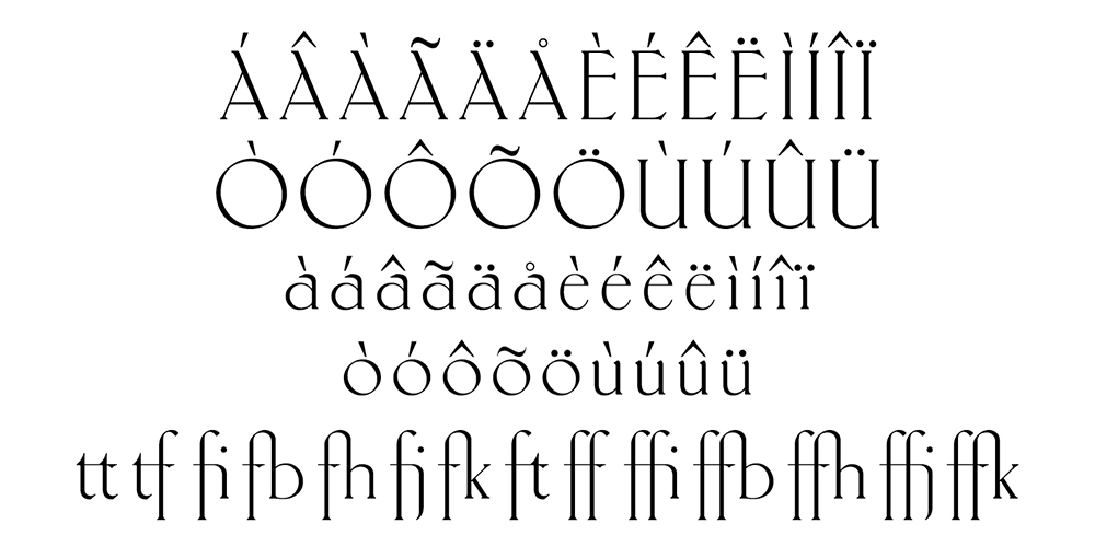


Typeface design Antiqua Roman. The biggest feature of it is that each letter contains a very thin stroke. Design based on the original hand-writing by Fritz Helmuth Ehmcke in 1907. Redesigned by Yuanchen in 2015.
This typeface is available on:
www.myfonts.com
Featured in:
![]()
![]()
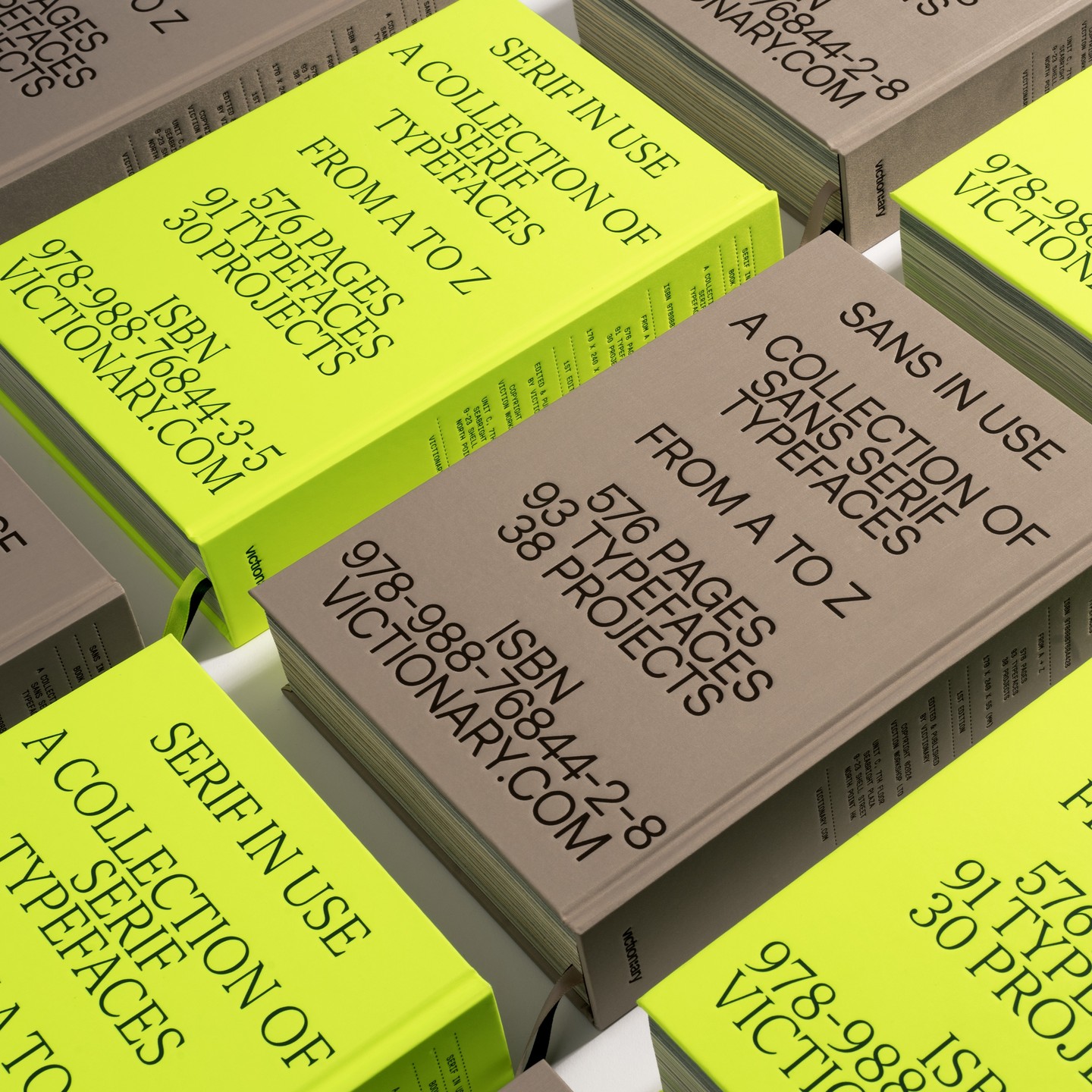
<Serif in use. A collection of serif typefaces. From A to Z> by Victionary
Font in use:
![]()
[1] Book cover.
![]()
![]()
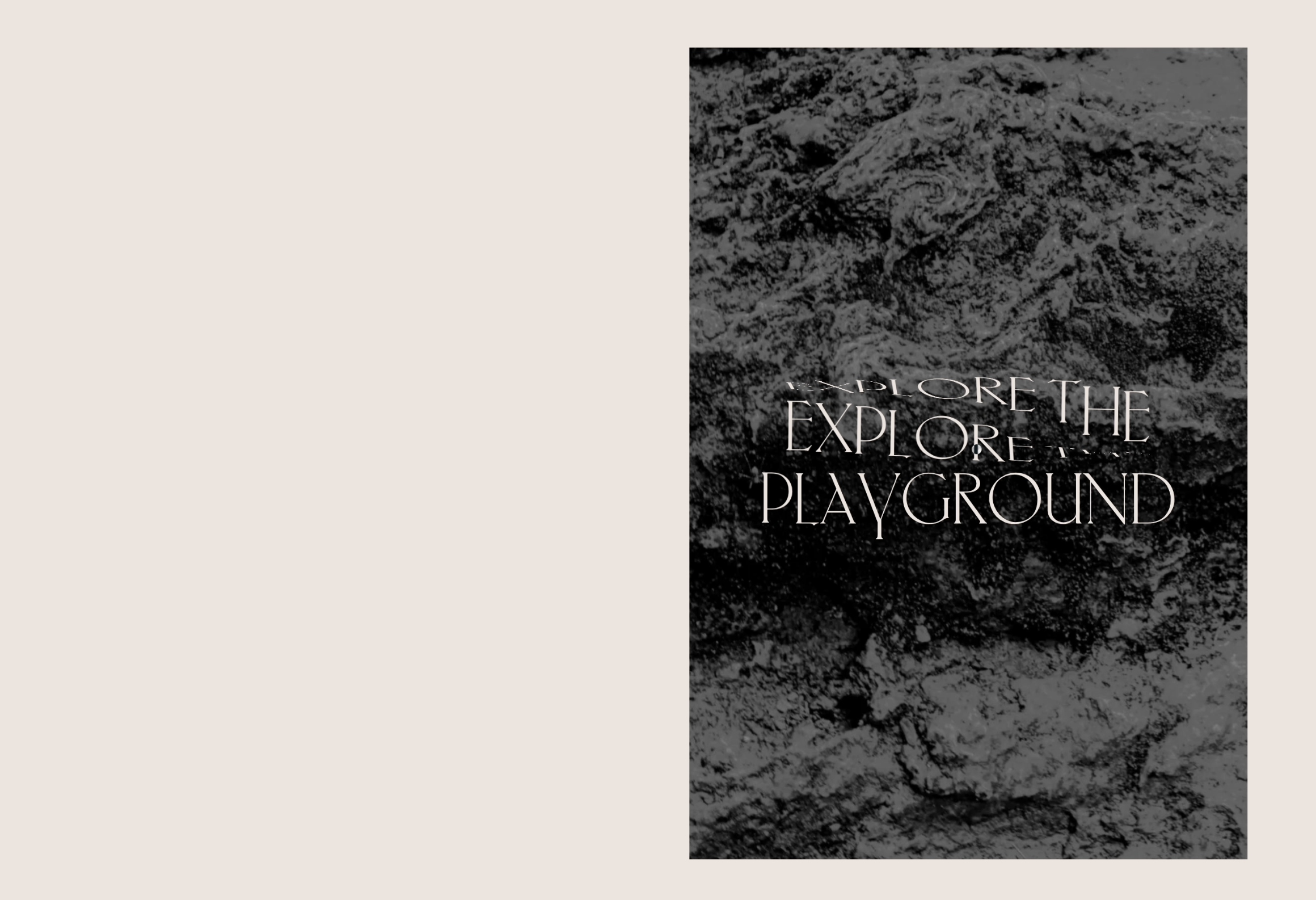
[2] Posters
https://www.instagram.com/p/CvNbSYzR-IE/?img_index=1
![]()
[3] Website:
https://dribbble.com/shots/6411066-Between-the-Hours
![]()
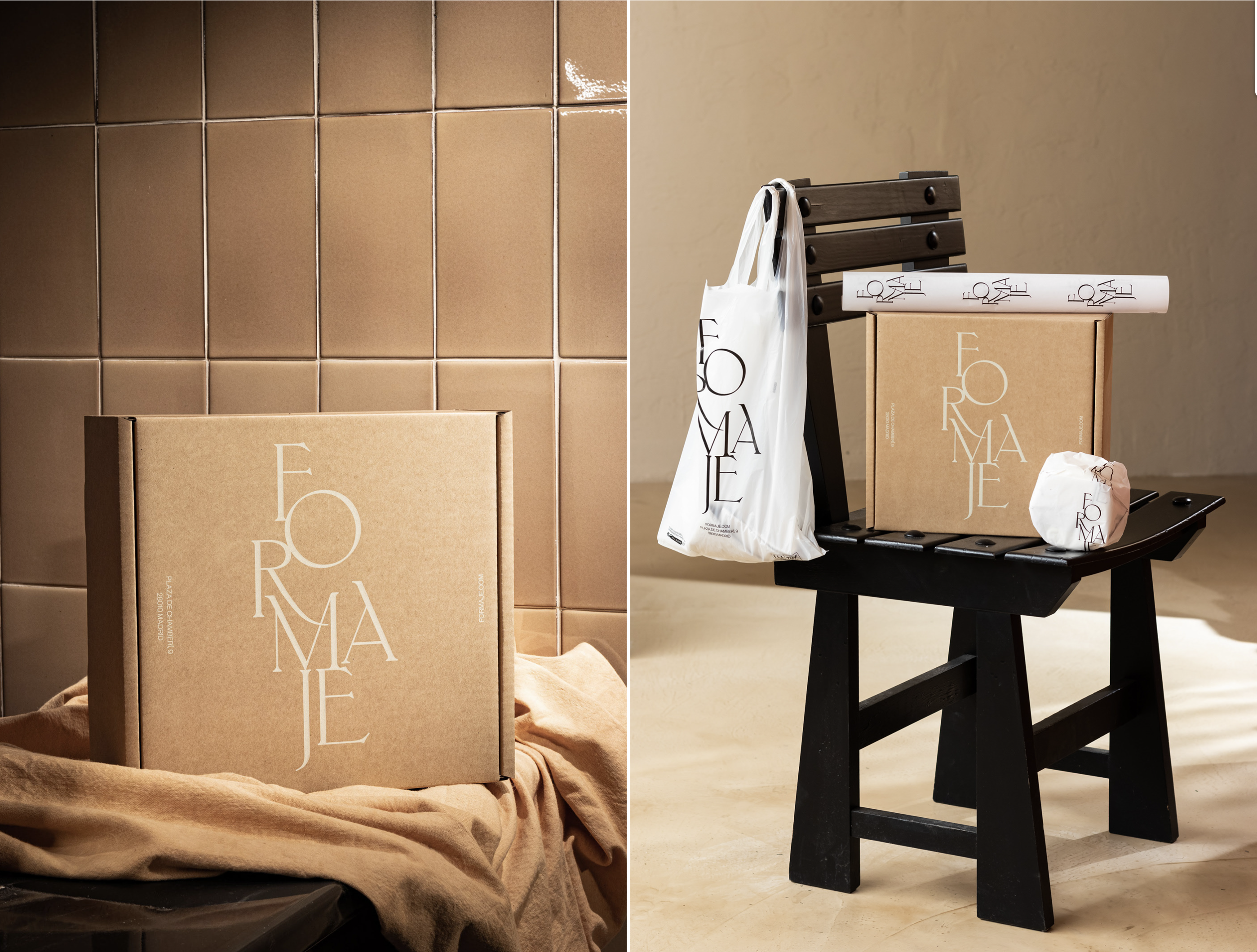
[4] Logo& Identity
https://www.behance.net/gallery/101549469/FORMAJE-CORPORATE?tracking_source=for_you_feed_activity
![]()
[5] Website:
https://isabelmoranta.com/
[6] Prints:
https://fontsinuse.com/uses/19448/schoenheit-und-abgrund-magazine
[7] Website:
https://nabazabih.com/
This typeface is available on:
www.myfonts.com
Featured in:


<Serif in use. A collection of serif typefaces. From A to Z> by Victionary
Font in use:

[1] Book cover.


[2] Posters
https://www.instagram.com/p/CvNbSYzR-IE/?img_index=1

[3] Website:
https://dribbble.com/shots/6411066-Between-the-Hours

[4] Logo& Identity
https://www.behance.net/gallery/101549469/FORMAJE-CORPORATE?tracking_source=for_you_feed_activity

[5] Website:
https://isabelmoranta.com/
[6] Prints:
https://fontsinuse.com/uses/19448/schoenheit-und-abgrund-magazine
[7] Website:
https://nabazabih.com/
