


*Visitors from CN need a VPN to access the video (from Vimeo).
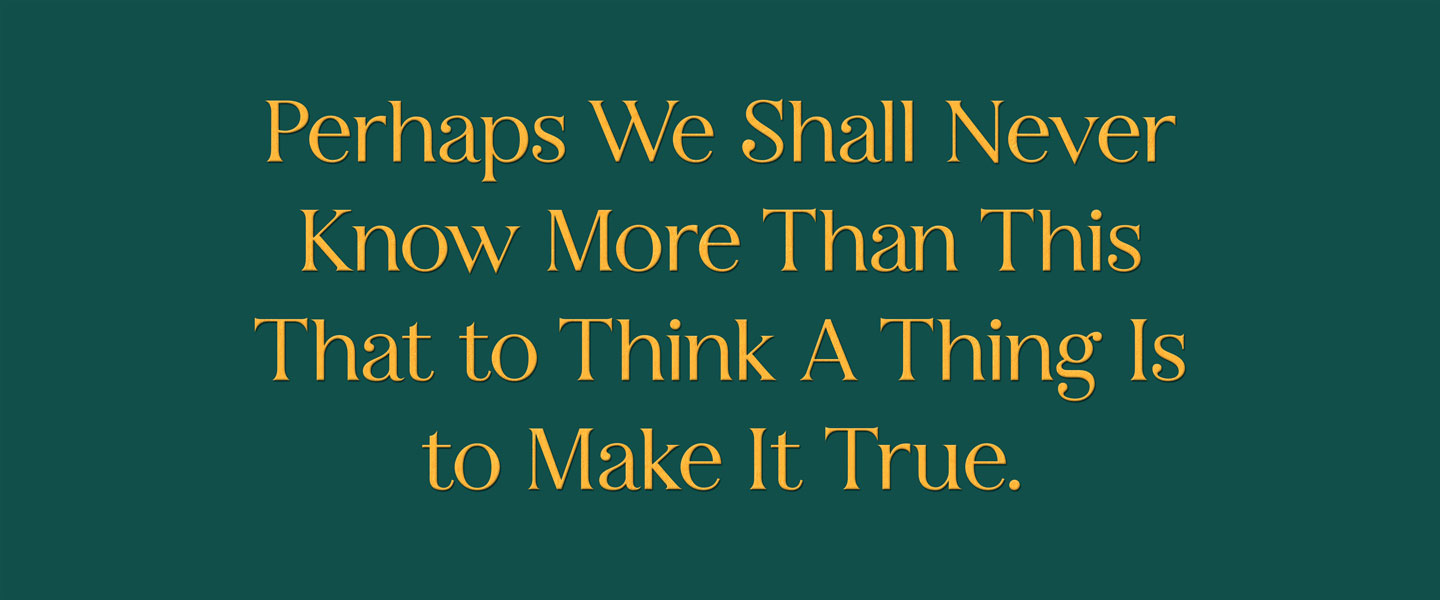
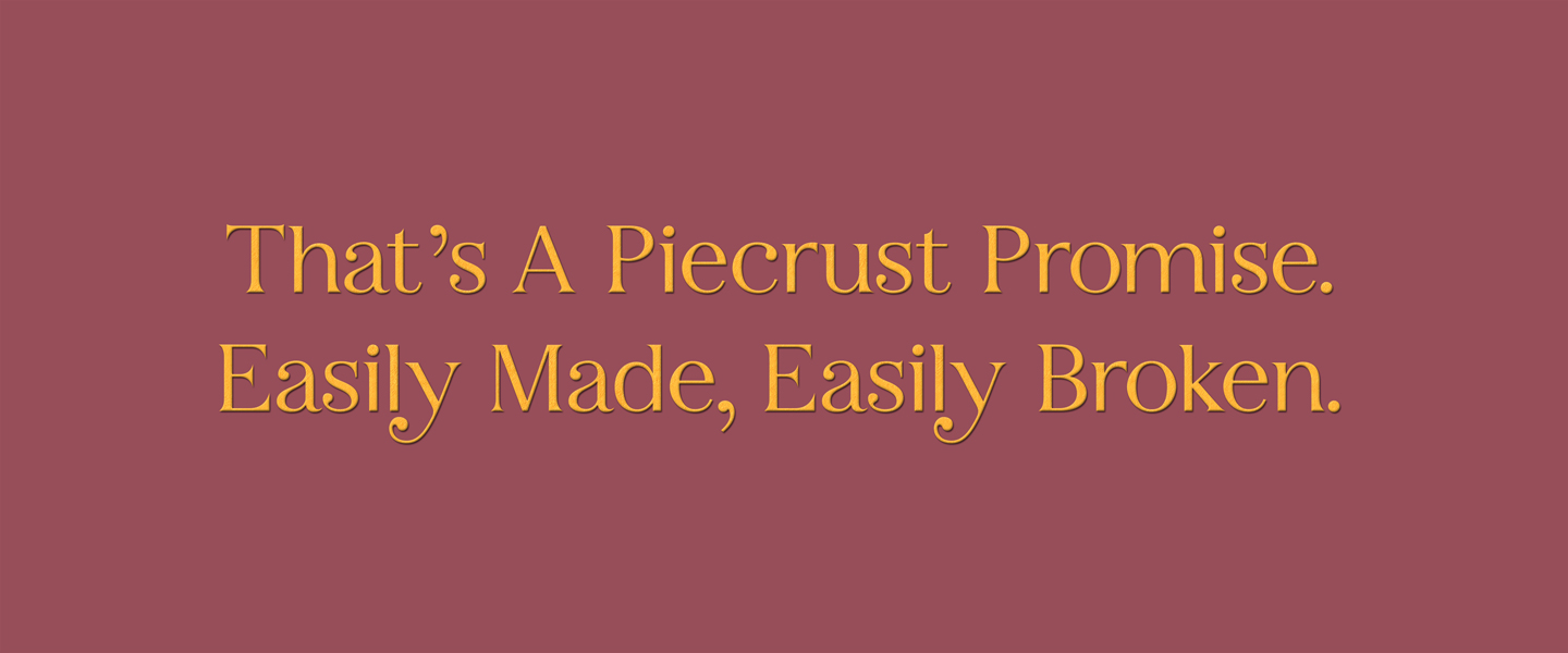
A set of typeface designed and used in the Opening and Ending title sequence of film “Mary Poppin’s Return”. The film is a classic musical piece. The placement of the typeface was referenced to the music node at different heights to create a delightful feeling. Also, for the detail, I was playing around with the tip part of the typeface within the range of classic serif font.