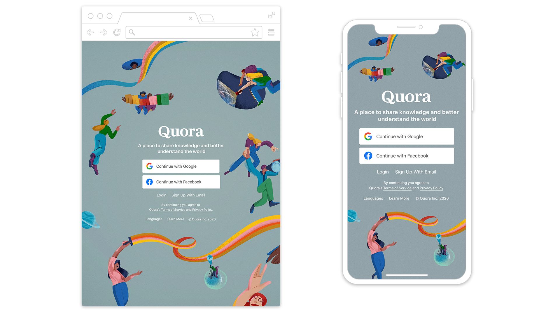
Quora landing page design.
Concept:
Quora is no longer a place just about Q and A around different topics. It is a non-tangible/ internet space where we transcend the limitations of the material world to arrive at a place of full encompassing knowledge. People in here are free and no longer limited by the EARTHLY RULES. On Quora, they are SHARING their knowledge, EXCHANGING ideas, EXPLORING new interests, REACHING new height. SEEING themself in new ways and BUILDING their own community. And more importantly, discovery and sharing on Quora are a journey full of excitement and fun.
Colleberated with Eugenia Mello.

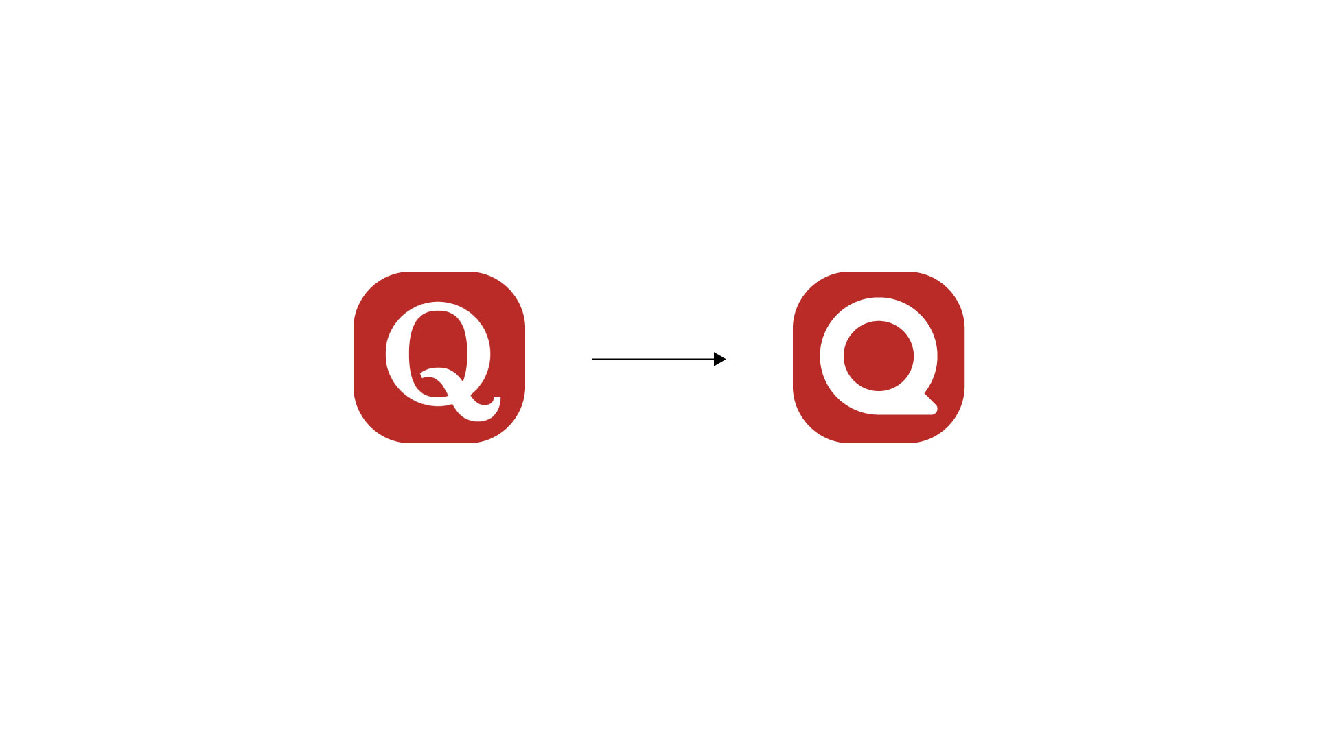
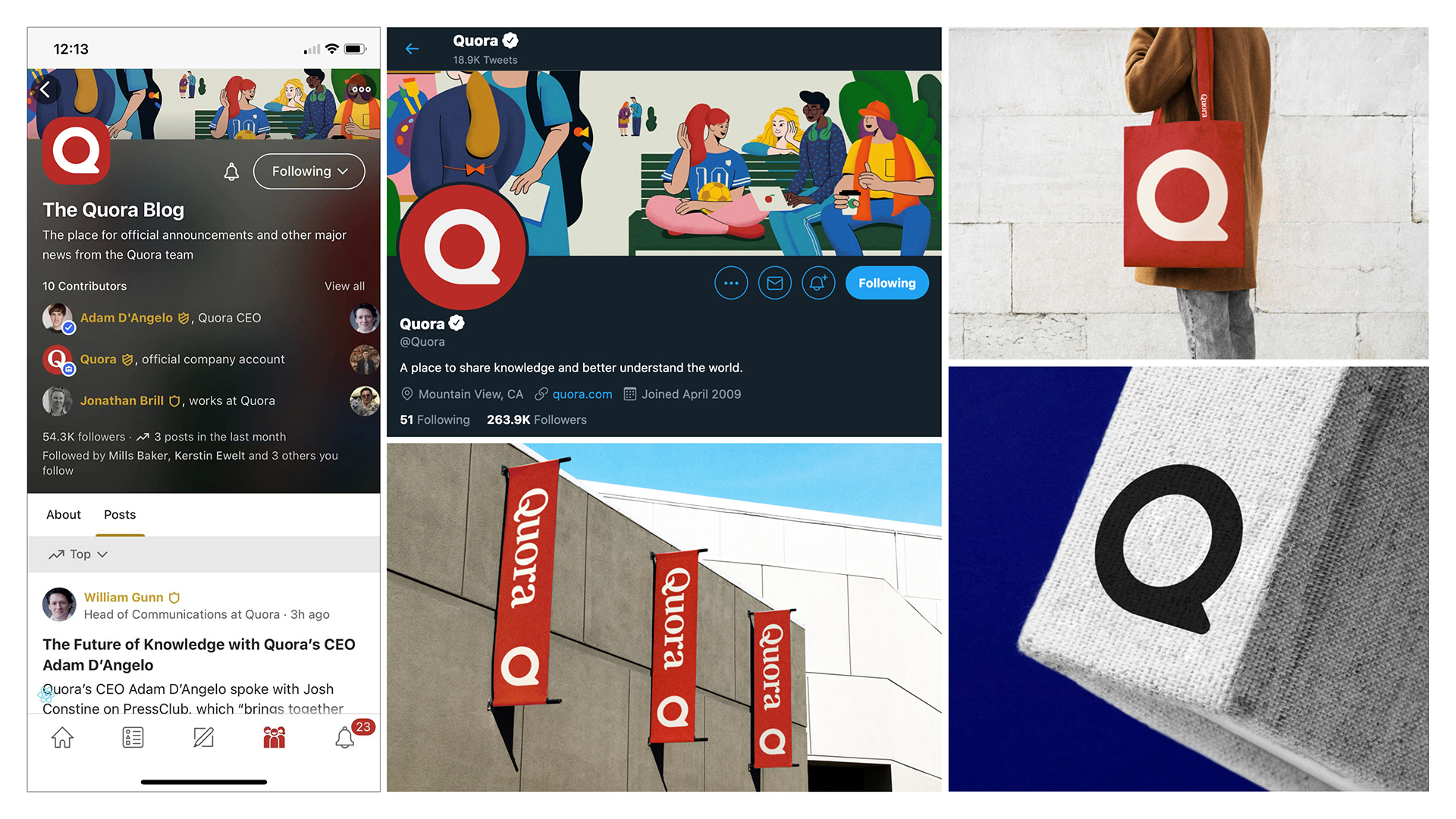
In 2021, Quora launched a new symbol.
Reasonings:
1. Company’s brand and identity evolves overtime. Last symbol was designed in 2014. We think it is time to give it a morden look. (2021)
2. There is a conspiracy group called Qanon that had a similar symbol to ours. In order to protect our brand image and get away from the bad influence from this group. Updating our symbol is a reasonable design action to take.
3. Quora is moving towards a direction that will be more mainstream (>300M Monthly Active Users). An iterated symbol that could help us to stand out from other popular apps visually. Also meaningly we want the new symbol to feel more universality.
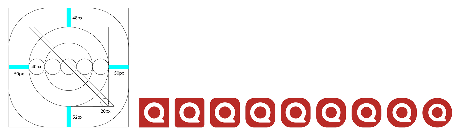
The design:
The new symbol still maintained the overall shape as an abstract Q. Also carries over a conversational feeling which intentionally gets us away from a traditional, only Q&A focused platform. This version stood out the most due to its simplicity and strong contrast. (Other options)
Comparison within industries.

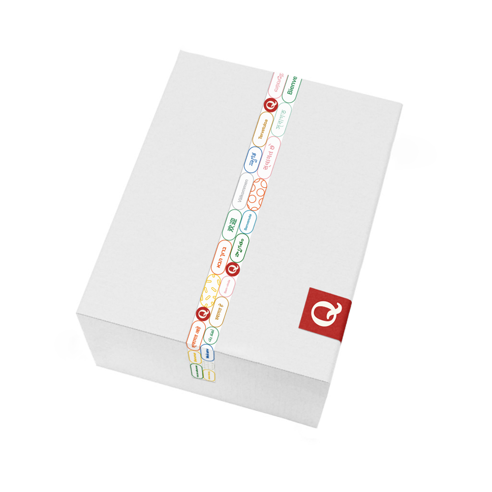
Top writer social announcement and new hire stickers.


New symbol application can be easily expend across teams and evernts.


Concepts for ads Quora ads campaign by using questons from Quora as promote.
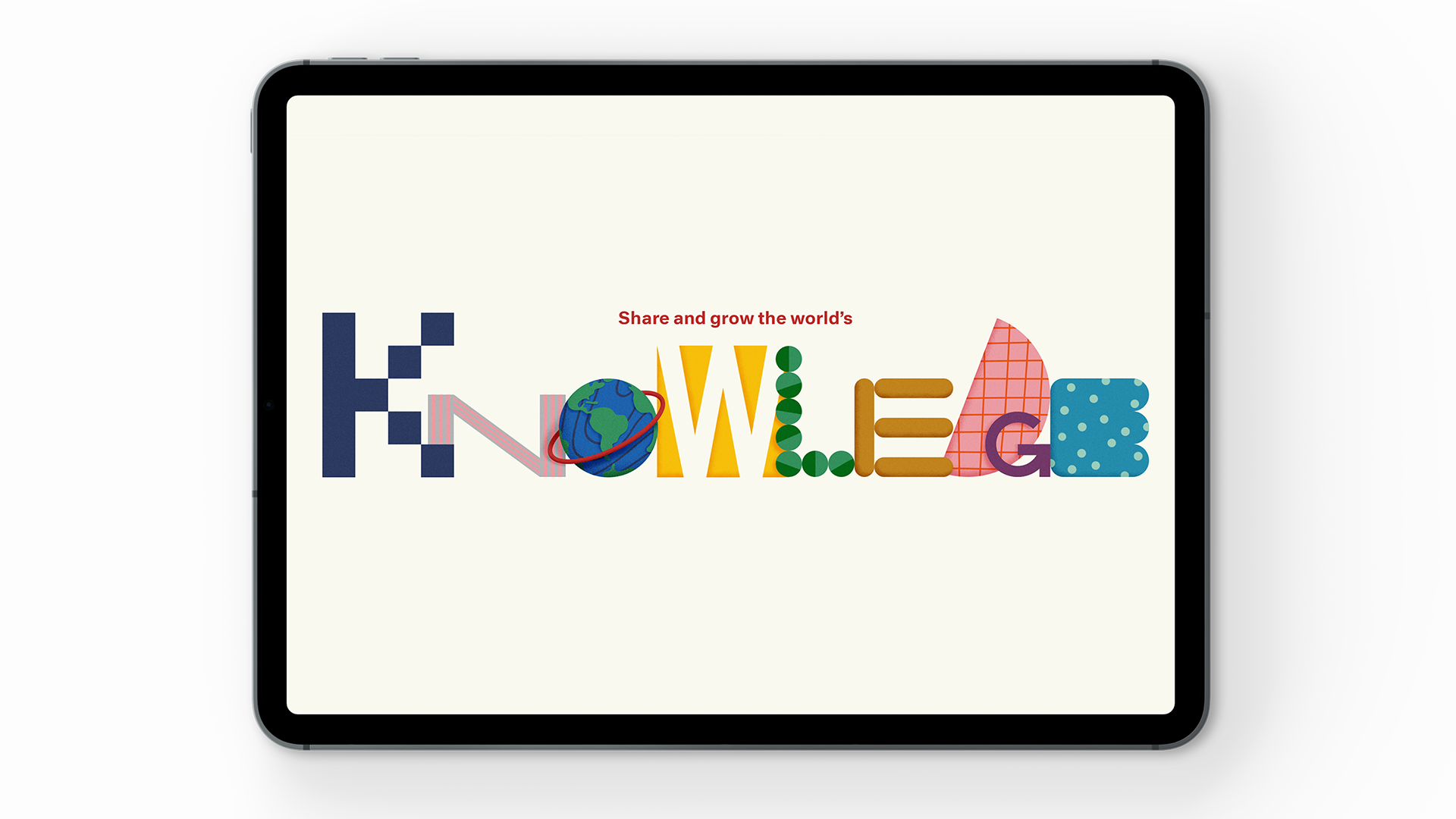
Application graphic “Share and grow the world’s knowledge.”
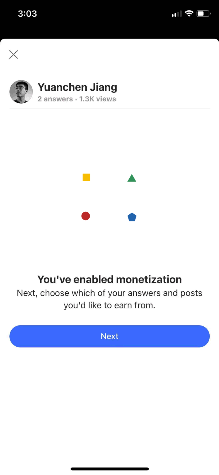
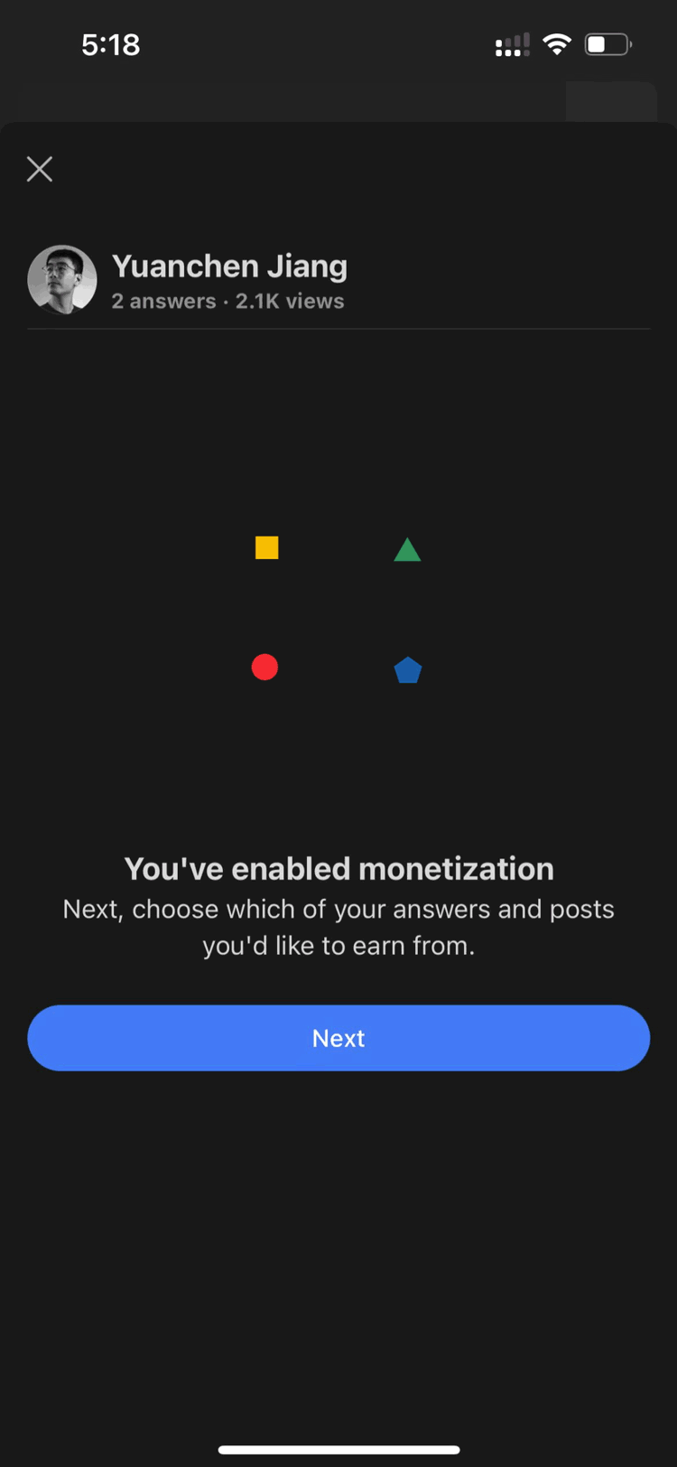
In product motion graphic for monetization.
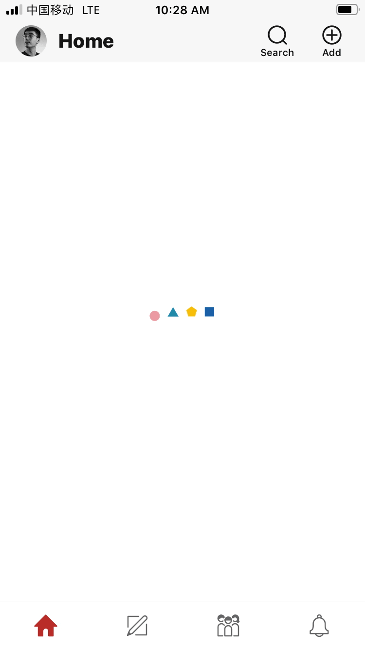
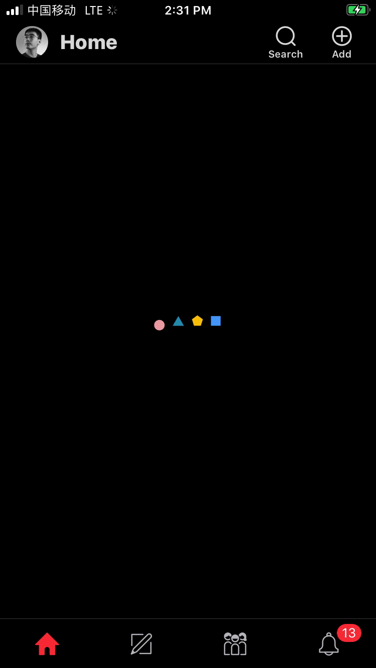
In product motion graphic (Loading Graphic) (Colleberated with Joro Chen).

Company value graphic
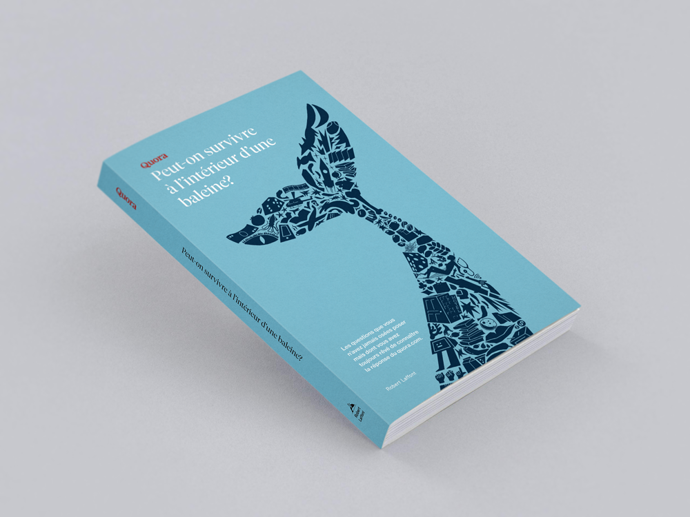
A book publish in French which collected 150 Q&A questions from Quora platform. The title of this book translated as “How to survive inside of a whale?” (Book Cover by Yuanchen Jiang. Interior design by Seungeun chung. Interior Illustration by Joro Chen)