
 Quora mobile UX redesign_Feed
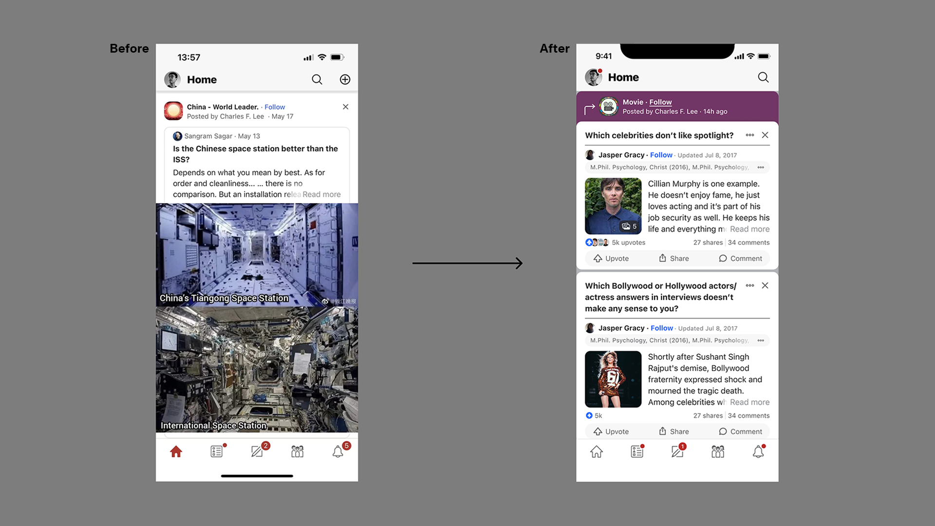
- New structure for internal share
- Use a card-over-card structure to replace the card-in-card structure to save wasted padding spaces on each side of the screen
- Bring in space theme color
- Clear on the information hierarchy
- Promote question to the top of each card

Opens up a new opportunity to show multiple answers (or ads) per question by swiping left/ right. Only the parts below the dividend line will move.
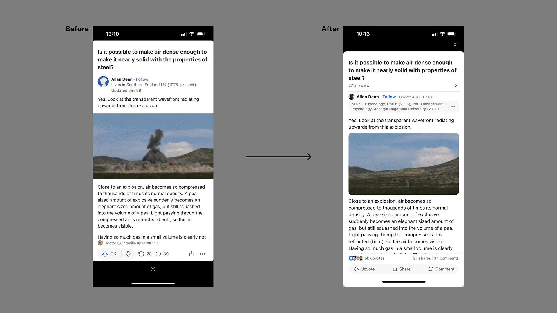
- Post-expend
- Surface how many answers are available. A divide line and more-answer indicator are added. So a user could know there are more answers to this question.

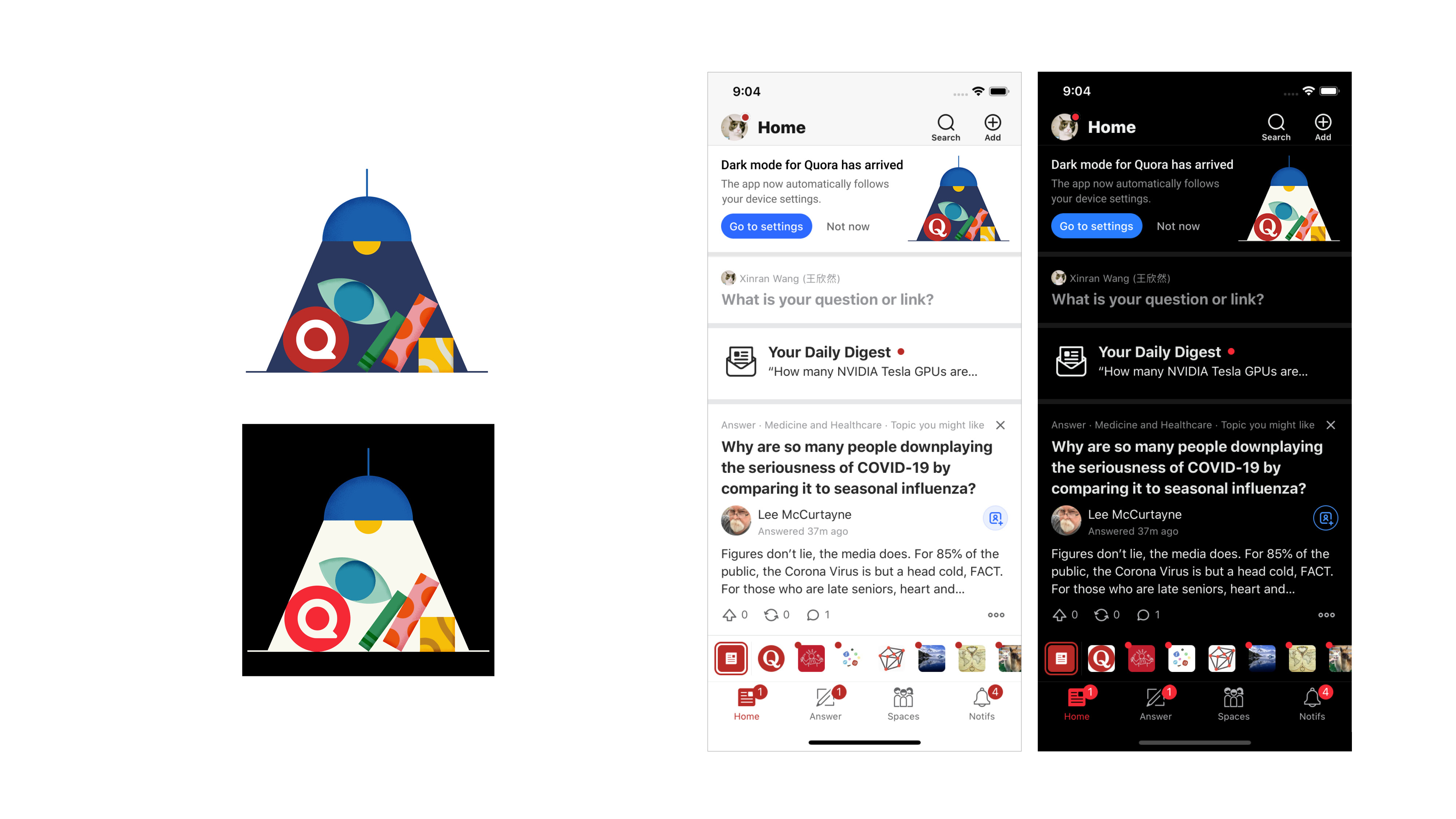
- Answer page
- Being consistent with the new feed structure.


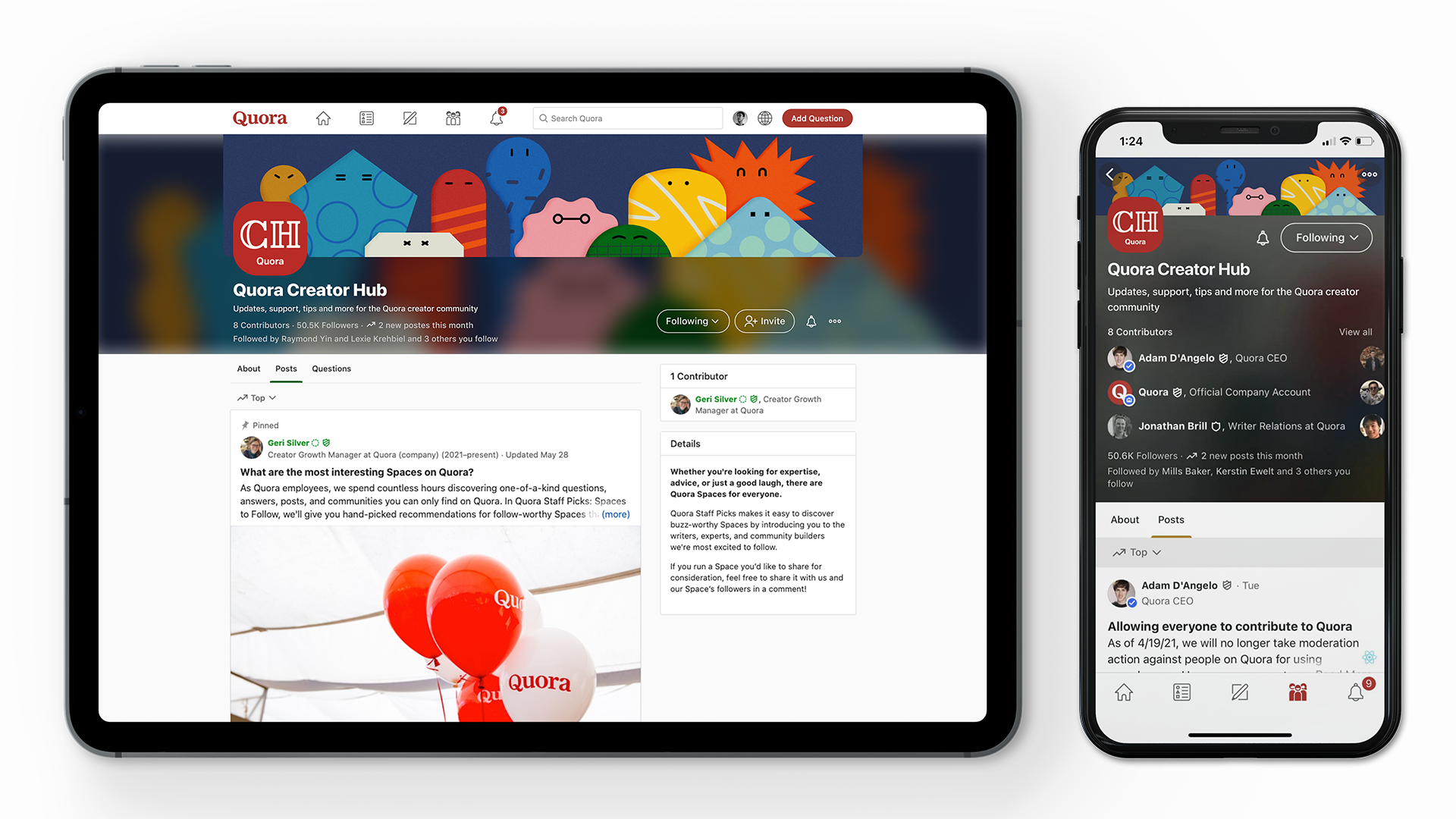
Rebranding for Quora Spaces.

Spaces subscription page design. UX improvement. Color system applys in product.


In-product key arts design to better support messaging expression.

Default profile image design.


Quora owned Spaces’ banner and identity design.
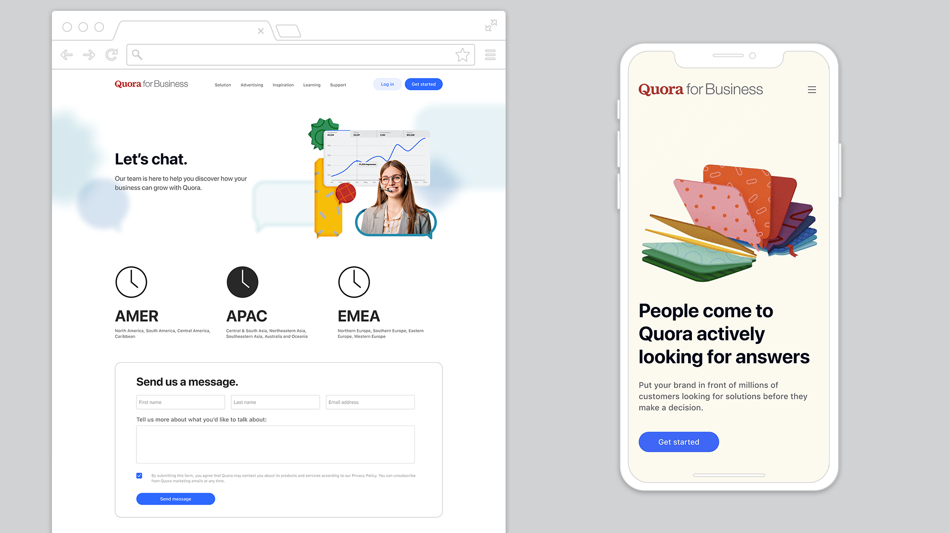

Web design for Quora Business.